Warm White Light Meaning: What to Check Before Buying Bulbs
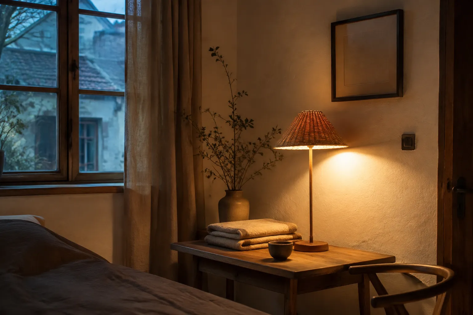
A warm pool of light can soften the contrast between a pale wall, a wooden table, and a woven shade. On a bulb package, warm white light means white light with a warmer-looking color appearance, often seen as more yellow or amber than neutral or cool white.
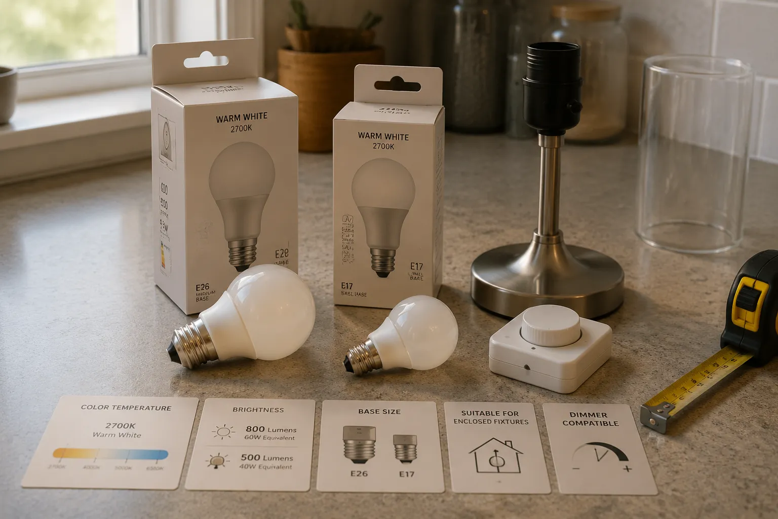
The name is only a starting point. Before buying, compare the listed color temperature, lumens, color-rendering information, bulb shape and base, fixture requirements, location suitability, and dimmer compatibility. Then judge one bulb in the intended room, alongside its walls, wood, textiles, daylight, and neighboring lamps.
broader context
Parent topic
Use the broader page when you need more context before this narrower page.
What “Warm White” Means on a Bulb Package
Warm white describes color appearance. The more useful package measurement is correlated color temperature, shown in kelvins and abbreviated as K. Among ordinary white-light bulbs, a lower listed value generally indicates a warmer appearance, while a higher value generally indicates a cooler appearance.
There is no single universal Kelvin range for the words warm white. Manufacturers and retailers may name or group similar products differently. Soft white light often appears near warm white in product ranges, but the terms should not be treated as identical across every brand.
Use the color name as a broad category, then compare the numerical color-temperature listings. If two packages both say “warm white” but show different Kelvin values, expect some difference in appearance.
Even matching values do not promise an exact visual match. Correlated color temperature does not describe every tint the eye may notice, and research on white lighting for residential applications discusses this limitation. Two bulbs with similar listed color temperatures may still look different when placed side by side.
For several visible lamps in one room, choosing the same product line and specification is a more dependable starting point than matching the words warm white alone.
Keep Brightness, Color, and Energy Separate
Bulb packages place several measurements close together, but each answers a different question.
| Package information | What it helps you compare | What it does not settle |
|---|---|---|
| Warm white or soft white | The general color category | An identical appearance across brands |
| Color temperature in K | Warmer-looking versus cooler-looking light | Brightness, energy use, or every visible tint |
| Lumens | Measured light output | How the fixture distributes that light |
| Watts | Electrical power used | Light output by itself |
| Watt-equivalent wording | Comparison with a familiar older bulb type | Exact equivalence in output, beam, color, or dimming |
| CRI or other color-rendering information | How the source is characterized for the appearance of illuminated colors | Whether every material will look as you prefer |
| Compatibility statements | Intended fixtures, locations, or controls | Uses beyond the product documentation |
The main distinction is brightness versus color appearance. Lumens describe measured light output; color temperature describes an aspect of visible color. A warm white bulb is not automatically dimmer, and a cooler-looking bulb is not automatically more powerful.
Perceived room brightness is less straightforward. A study of scene brightness in illuminated interiors examined how light level, surface reflectance, and color temperature can work together in a controlled setting. That research does not provide a fixed household formula. It does show why lumens alone cannot predict the complete impression of a room.
A bare bulb spreading light in several directions will not illuminate a room like a shaded lamp that directs most of its output downward, even when the packages list similar lumens. Wall reflectance, shade material, beam distribution, and fixture position all affect what you see.
Energy use is separate again. Do not infer efficiency from the warm or cool appearance of a bulb. Compare the wattage and energy information for the individual product. The U.S. Department of Energy’s consumer guidance also distinguishes light output from the electricity a bulb uses.
Check the Fixture Before Choosing the Color
The fixture narrows the choice before room style does. Read its documentation and inspect the existing bulb if its markings remain legible. Confirm the required base, physical dimensions, electrical limits, and any restrictions stated by the fixture maker.
Checks to make before purchase
- Base and size: The base must match, and the bulb body must fit inside the shade or enclosure without forcing it into place.
- Fixture requirements: Follow the fixture documentation rather than relying on prominent replacement or watt-equivalent wording on the bulb package.
- Enclosed-fixture suitability: Do not assume a bulb intended for an open lamp is suitable for a closed globe. Look for a product-specific statement.
- Location suitability: In bathrooms, covered outdoor fittings, or other exposed positions, compare the bulb and fixture documentation with the actual setting.
- Dimmer compatibility: Confirm that the bulb is identified as dimmable and check any control-compatibility information supplied by the manufacturer.
- Low-voltage systems: Where a fitting uses a transformer or related equipment, compatibility must be checked across the available product documentation.
The Department of Energy’s LED equivalency guidance treats output, color quality, light distribution, dimming behavior, and system compatibility as separate comparison points. It is useful as a framework, although its historical program details should not be read as current product requirements.
“Dimmable” also does not necessarily mean that the light becomes warmer as it dims. Some bulbs are designed to change color appearance as output falls; others remain close to the same nominal color temperature. Check the product description for both the dimming behavior and the intended controls.
The package color name never overrides the fixture documentation.
Let the Room Make the Final Comparison
A bulb illuminates surfaces; it is not experienced in isolation. Matte plaster, pale linen, dark timber, glazed tea ceramics, and glossy paint each return light differently. The source and the reflective properties of the object both contribute to the color that reaches the eye.
Color-rendering information can help when comparing bulbs, but it answers a different question from color temperature. No single package number can guarantee how a particular wood finish, textile dye, artwork, or serving dish will appear in your room.
Test one bulb before committing to a full set
- 1.Install it in the fixture where it will be used.
- 2.View the room after daylight has faded, then again with daylight present.
- 3.Look at the main wall, floor, wood, textiles, ceramics, and artwork instead of staring at the lamp.
- 4.Notice the shade: an opaque shade directs light, a translucent shade may add its own color, and an open fitting exposes more of the bulb.
- 5.Turn on neighboring lamps and check whether their whites look consistent or visibly mismatched.
- 6.Decide whether the output suits the room’s task without confusing brightness with warmth.
Daylight can make a warm lamp appear more yellow by comparison, particularly near a window. At night, the same lamp may look closer to neutral once it becomes the dominant source. A cream shade can add warmth, while a strongly colored shade may alter the result more noticeably. Dark wood and dense textiles may return less light than pale, reflective surfaces, changing the room’s overall appearance without changing the bulb’s listed output.
Preference belongs at this stage. Controlled studies can identify patterns under defined conditions, but they cannot select one bulb for every household. Warm white may look coherent beside wood, woven cloth, and tea ceramics, yet the same bulb may make a work surface look less crisp than its user prefers.
The smallest useful buying check is to compare the numbers, confirm the fixture requirements, and try one bulb in the real room. Let the walls and objects settle the choice.